Tuesday, December 11, 2007

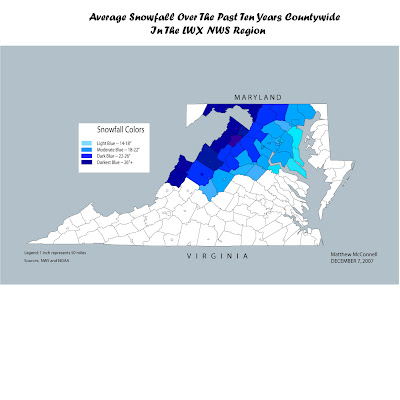
Final Map


5 links:


This link is the Climate Prediction Center in which you can find out any information you want ranging from Tropical Weather to Winter Weather.


The National Weather Service Homepage. Need to know the weather for anywhere in the US within the next 7 days? Here is where you can get easy access to it.


This website shows you the average snowfall through 2002 of all the major cities across the 50 states (including Hawaii and Alaska). The data varies though on when the city or airport near the region began taking measurements -- DC began in 1943 while New York City in Central Park began 134 years ago.


This is a useful website that I found that shows how much snow a city with a population of at least 50,000 gets per winter on average. (Top 101 Cities in the US)


LWX's (Sterling WFO) Climate Page. This website can tell you the average snowfall at KIAD, KDCA, KBWI, and more. It also can give you exact amounts of how much snow fell in past years, though it depends on the airport you are closest to.

Tuesday, November 20, 2007

Lab 10


I found an interesting inverse relationship between the two sets of data I chose to map -- the higher the median income is in the county, the less poverty there is in the county...


Saturday, November 17, 2007

Bivariate Maps...


I found this map to be an interesting map because it combines color with population. The scale according to the site is a two-color array that combines that total population of whites and asians in the state of Virginia. The color array is differentiated into a darker red for more of the Asian population.. with a darker blue for more of a white population. It is interesting that there is not much mix except for Northern Virginia in the counties of Loudoun, Fairfax, and Prince William Counties.. which is close to downtown DC. It is also interesting to note that there appears to be very few counties outside Northern Virginia with a large Asian population.
The use of the two-color array is a good example of how to show a bivariate map. It is easy to understand and for the map's audience to see what is presented.

Sunday, November 11, 2007

Color Choropleth Map

http://www.turboperl.com/dcmaps.html

While looking online for color choropleth maps, I came across this website. This website is interesting in the fact that it shows one type of scale, natural breaks. This leads to some maps having large amounts of data in some of their zones. The maps were developed by Dr. William Smith, and the maps that he helped make make it easy to see how a color choropleth map changes color and shape when different data is input.

Friday, November 2, 2007

Dot Density Map of African American Pop. in 1960 over US

Source: http://www.uic.edu/educ/bctpi/greatmigration2/dataviewer/usa/USAcounties.html

This map shows the dot density of the African American Population across the United States in 1960. It is interesting to note that most of the population is along and East of the Mississippi River and along what is now known as the I-95 corridor or over most of the SE US. We see that in the Midwest and West, except for a few cities such as Denver and San Francisco, there were not a large amount of African Americans living there.

Friday, October 26, 2007

Two Maps -- One Election Map and One Energy Consumption Map


Both of these maps are very interesting. The top map shows Energy Consumption across the United States before the turn of the century using circles, which makes the map easier to read. It seems weird looking at the map that LA and WY are the biggest energy consumers. The second map is an intriguing map I found online regarding the 1996 presidential elections. Its a weird map that shows proportionality and chloroplethic tendencies on how the state voted for either the Democrat or Republican presidential candidate.

Friday, October 19, 2007


This image I found at this website: http://www.censusmapper.com/CM_Help/choroplethmaps.htm shows the percentage of population in poverty across the United States. It seems to show that the greatest area of poverty is in the Southern and Southeastern portion of the nation. You can also note that there are some "holes" where major cities are located in the South. One could ask if being in a rural area has anything to do with being in poverty.